
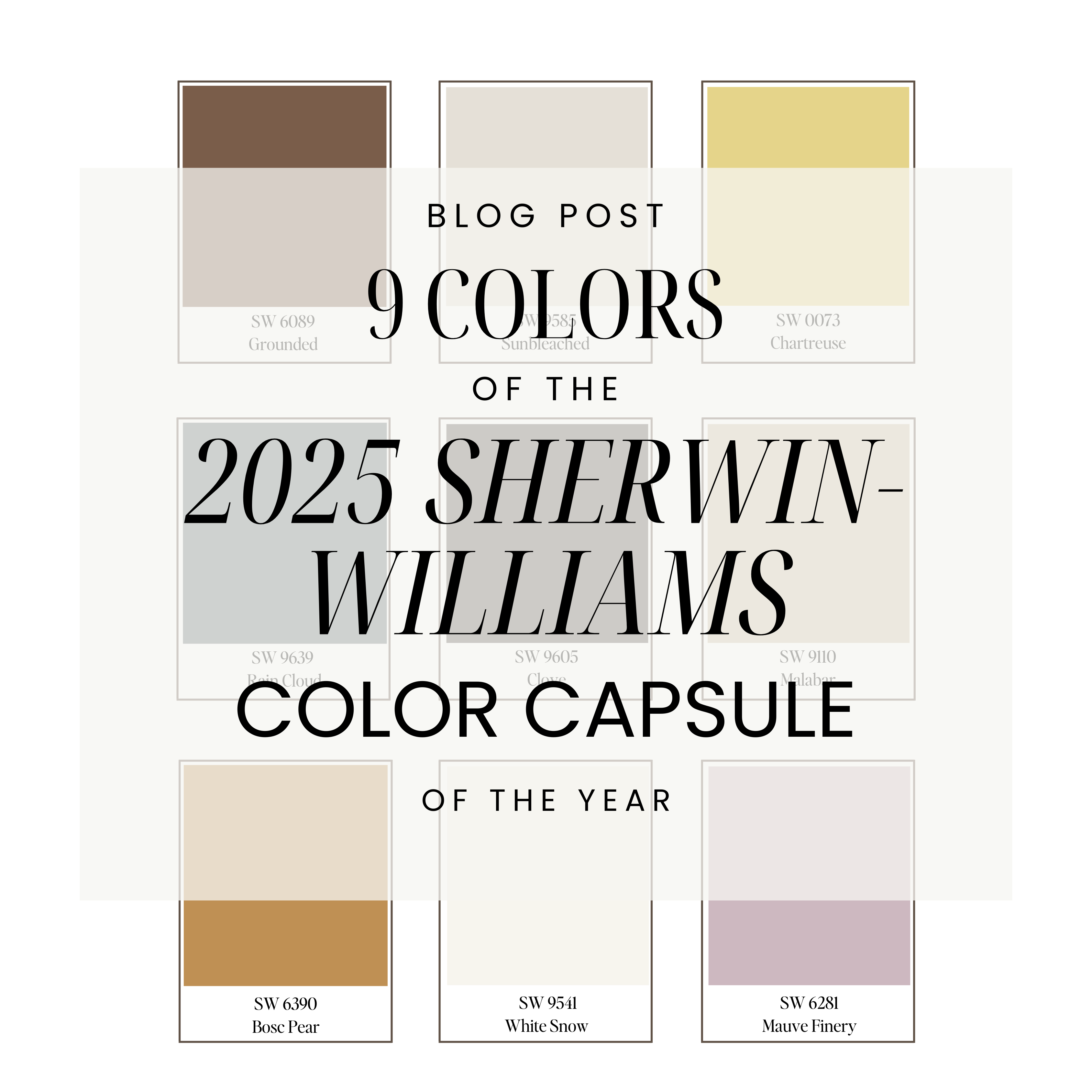


In this post: The 9 colors of the 2025 Sherwin-Williams Color Capsule.
Each year Sherwin-Williams creates a color capsule of the year.
The Director of Color Marketing, Sue Wadden states,
“Our Color Capsule of the Year can be curated to stand out with any style. We wanted a modern, fresh take on color, with a balanced and usable assortment of shades.”
This years colors lean warm, rich, and have a lot of personality.
Let’s take a look at each color:
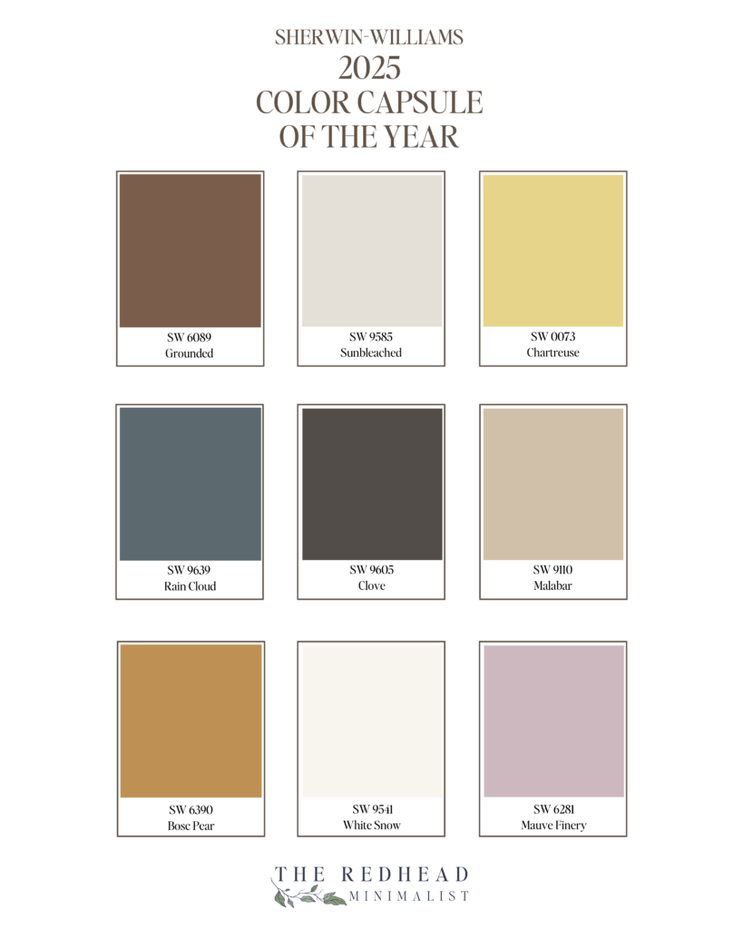
1. SW 6089 Grounded
One of the warmest shades from Sherwin-Williams’ 2025 Color Capsule is Grounded (SW 6089)—a warm, earthy brown that lives up to its name.
With subtle red and rosy undertones, it brings a soft, clay-like warmth to any space without feeling too heavy or dark. Grounded strikes the perfect balance between cozy and sophisticated, making it an ideal choice for bedrooms, living rooms, or even cabinetry.
It pairs beautifully with creamy whites, muted blush tones, and warm woods.
2. SW 9585 Sunbleached
Another favorite from the 2025 Sherwin-Williams Color Capsule is Sunbleached (SW 9585)—and it’s every bit as soft and easygoing as it sounds.
This beautiful light neutral sits right between beige and gray, with just the right touch of warmth. It has subtle taupe and cream undertones that give it that lived-in feel.
Sunbleached is perfect if you’re looking for a calming backdrop that works well with both warm and cool tones. It’s especially lovely in coastal farmhouse spaces where you want things to feel light, layered, and effortless.
3. SW 0073 Chartreuse
If you’re looking to bring a little energy and personality into your space, Chartreuse (SW 0073) might just be your color crush.
It’s a bold, vibrant yellow-green with sunny undertones that feel fresh, fun, and a little unexpected.
There’s a definite citrusy warmth to it, balanced by a lively green that keeps it grounded. In the right light, you might even catch a hint of golden glow.
While it’s definitely not a neutral, it can play really well in small doses—think accent walls, a front door, or even a vintage-inspired piece of furniture. It’s a great way to add a playful pop to a more relaxed, coastal farmhouse palette in pillows, throws, artwork, painted furniture, and accessories.
4. SW 9639 Rain Cloud
If you’re craving a moody coastal farmhouse hue, Rain Cloud (SW 9639) is a color worth considering.
It’s a soft, cool blue-gray that feels like a peaceful overcast sky.
The blue undertones give it a calm vibe, while the cool gray keeps it feeling balanced and versatile. Depending on your lighting, you might even notice a slight green undertone peeking through, especially in spaces with lots of natural light.
Rain Cloud pairs beautifully with creamy whites, sandy taupes, brushed metal accents, and natural textures like linen or driftwood.
It’s perfect for an accent wall, a cozy bedroom, or even painted cabinetry if you’re ready to lean into those soft, stormy tones in a subtle and sophisticated way.
5. SW 9605 Clove
If you’re looking for a bold, grounding color that still feels warm and lived-in, Clove (SW 9605) is a beautiful choice.
It’s a rich, earthy brown with subtle red and mahogany undertones that give it depth and a sense of warmth—like a favorite spiced candle.
In certain lighting, it can even lean almost black, which adds just the right amount of drama without feeling cold or stark.
Clove works beautifully in cozy spaces like a reading nook, a moody half bathroom, or even on cabinetry for a sophisticated, layered look.
Pair it with soft whites, natural textures, and brushed metals for a palette that feels grounded and refined.
6. SW 9110 Malabar
If you’re drawn to soft, sun-warmed neutrals, Malabar (SW 9110) might just be your perfect backdrop. It’s a warm, sandy beige with subtle peach undertones that give it a gentle, sunbaked glow — just like the beach at golden hour.
Depending on the light, you might catch a soft rosy or coral tint, but it never feels overly pink.
Malabar is one of those easy, comforting colors that works beautifully in coastal farmhouse spaces. Pair it with warm whites, layered linen textures, and natural wood accents for a relaxed, welcoming vibe that still feels polished and timeless.
7. SW 6390 Bosc Pear
If you’re craving a rich, earthy color that still feels cheerful and grounded, Bosc Pear (SW 6390) might be for you. The best way to describe it is retro-meets-organic.
This warm, muted yellow has subtle brown and olive undertones—it’s not bright or bold, but rather soft and mellow, like a golden pear. It brings a cozy, vintage warmth to any space, especially when paired with warm woods, creamy whites, or deeper tones like Clove.
Whether you use it as an accent wall, on a piece of painted furniture, or even in a half bathroom for a touch of unexpected color, Bosc Pear adds just the right amount of personality while keeping that relaxed, organic feel.
8. SW 9541 White Snow
If you’re looking for a bright, clean white, White Snow (SW 9541) is a beautiful choice. It’s not too cold or stark, but it’s a little warmer than the popular Alabaster.
It leans warm, but it doesn’t look creamy or yellowy. In certain lighting it has a very subtle beige or greige undertone, making it the perfect grounding neutral.
Whether you use this color on walls or trim, it’s fresh and light-filled look work beautifully in coastal, modern farmhouses, and minimalist spaces.
Another highlight is that White Snow can be found in the Emerald Designer Edition collection of Sherwin-Williams.
9. SW 6281 Mauve Finery
What is mauve anyway? Mauve is created mixing red and gray or a neutral. The results can lean pink, lavender or even taupe. Mauve Finery (SW 6281) is a soft, muted mauve that feels romantic, calm and a little bit vintage.
Lavender is the primary base making this shade appear like a dusty, powdery lavender. It has hints of muted pink, but with a gray base that tones it down a bit.
Overall, Mauve Finery leans cool and works well in bedrooms, sitting rooms, and even bathrooms. It pairs beautifully with warm whites, aged brass, natural linens, and textured layers.
I often spot this shade while browsing antique furniture stores—usually in the form of a vintage velvet sofa or an elegant, timeworn chair.
So there you have it—the 9 stunning shades from the 2025 Sherwin-Williams Color Capsule of the Year.
Each one brings its own unique personality, whether you’re drawn to soft, sun-washed neutrals or deeper, moodier tones full of warmth and character.
Which color speaks to you the most? Was there one that surprised you or sparked a new idea for a room in your home? I’d love to know which one you’re drawn to—and how you might use it to add a little beauty, comfort, or personality to your space. Let’s keep the color conversation going!
Leave a Reply


Click Here to leave a comment
Comments