
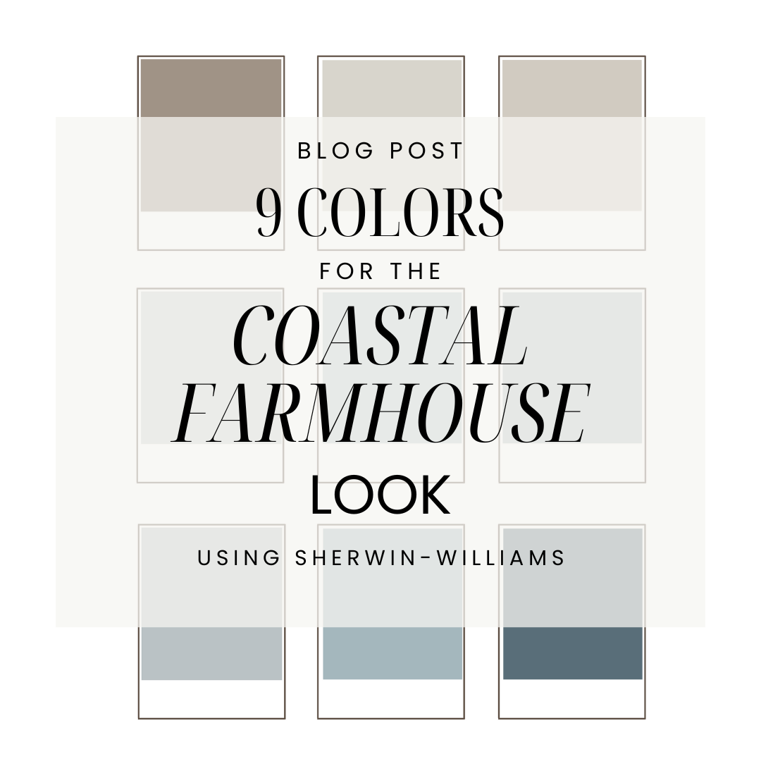


In this post: Where to use 9 Sherwin-Williams blue-gray colors to create the coastal farmhouse look.
A popular color trend right now is the Coastal Farmhouse look.
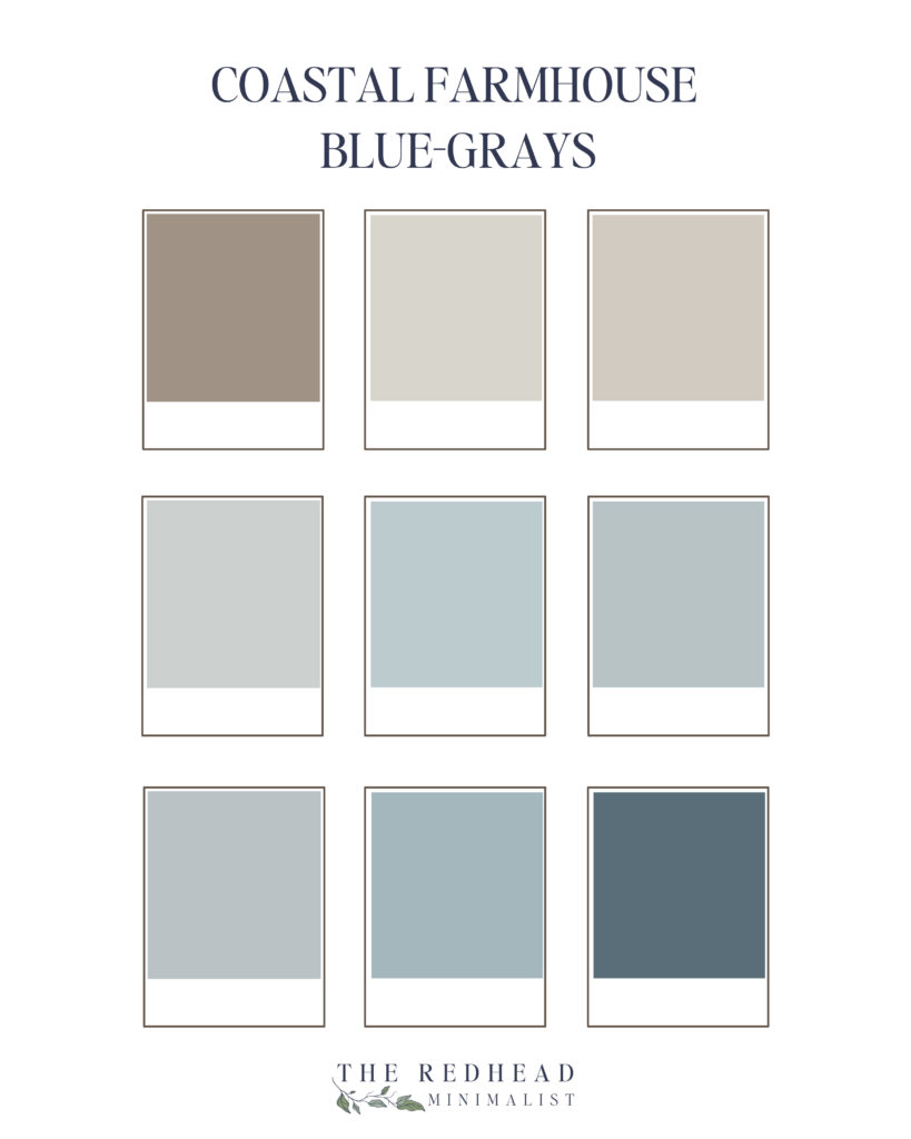
After doing a deep search of the perfect blue-gray tones, I’ve selected 9 colors for the Coastal Farmhouse vibe. These colors pair beautifully for a home that is already “cool-toned.” This just means that your home leans toward cooler colors like crisp white, charcoal grays, and blues. New construction homes typically are built with cooler tones in mind, while homes older than ten years typically show a warmer undertone with yellows and beiges.
As a military family, with Bryce serving in the US Navy, we’re stationed in sunny Pensacola, Florida—for the second time. Pensacola is home to the Blue Angels, sugar-white beaches, and golden sunrises that paint the sky in shades of pink and blue. My girls and I call these our Mary Poppins skies because they feel straight out of a storybook.
We live on base in a charming historic home dating back to the 1870s.
As much as I love a coastal farmhouse aesthetic, it just doesn’t quite fit in this southern, historic setting—just like you wouldn’t expect to see cool, beachy tones in a ski lodge in Aspen.
That said, I’ve created plenty of coastal-inspired spaces for clients and always get excited to reach for my Sherwin-Williams paint samples to bring those breezy, serene vibes to life where they truly belong.
So what exactly is “coastal farmhouse” anyway?
A coastal farmhouse aesthetic blends the breezy, relaxed feel of coastal living with the warmth and charm of a classic farmhouse. One of the best ways to bring this look to life is with blue-gray paint colors—a perfect mix of soft, muted blues and sophisticated grays. You can also certainly use shades of green, but that’s for another article.
Flipping through the paint samples can be quite overwhelming. As a Certified Master Color Consultant, I help my clients bring their vision to life by preselecting a range shades based on a client questionnaire they completed.
If you’re itching to get started and pick out your colors this weekend, I’ve created a list of five key factors to consider that will save you a lot of time, money and grief.
1. Understanding If Your Home’s Undertone is Cool or Warm.
Undertones
Understanding undertones is key to ensuring your paint complements the other elements in your space. Take a walk through your home and look for common undertones in your countertops, tile, backsplash, wood floors, cabinets, furniture, and fabrics.
Do you notice warmer tones like yellows and creams, or cooler tones like blues and crisp whites?
A great trick is to hold a white poster board next to these features. This helps create a neutral backdrop, making undertones easier to spot. Once you identify the dominant undertones in your home, choosing a paint color that harmonizes with them becomes much simpler!
2. Consider the Room’s Purpose & Lighting Before Choosing Your Colors
Purpose
The function of the room plays a huge role in selecting the right shade – dark or light.
- Main Living Areas, Hallways & Kitchens: Greige (gray + beige)is a popular color trend because it creates a cohesive and inviting flow throughout the home. It also ages well. Greige offers a balanced backdrop that complements a variety of furnishings and décor and can warm up a very cool toned home
- . Sherwin-William’s Accessible Beige or Agreeable Gray are two very popular colors.
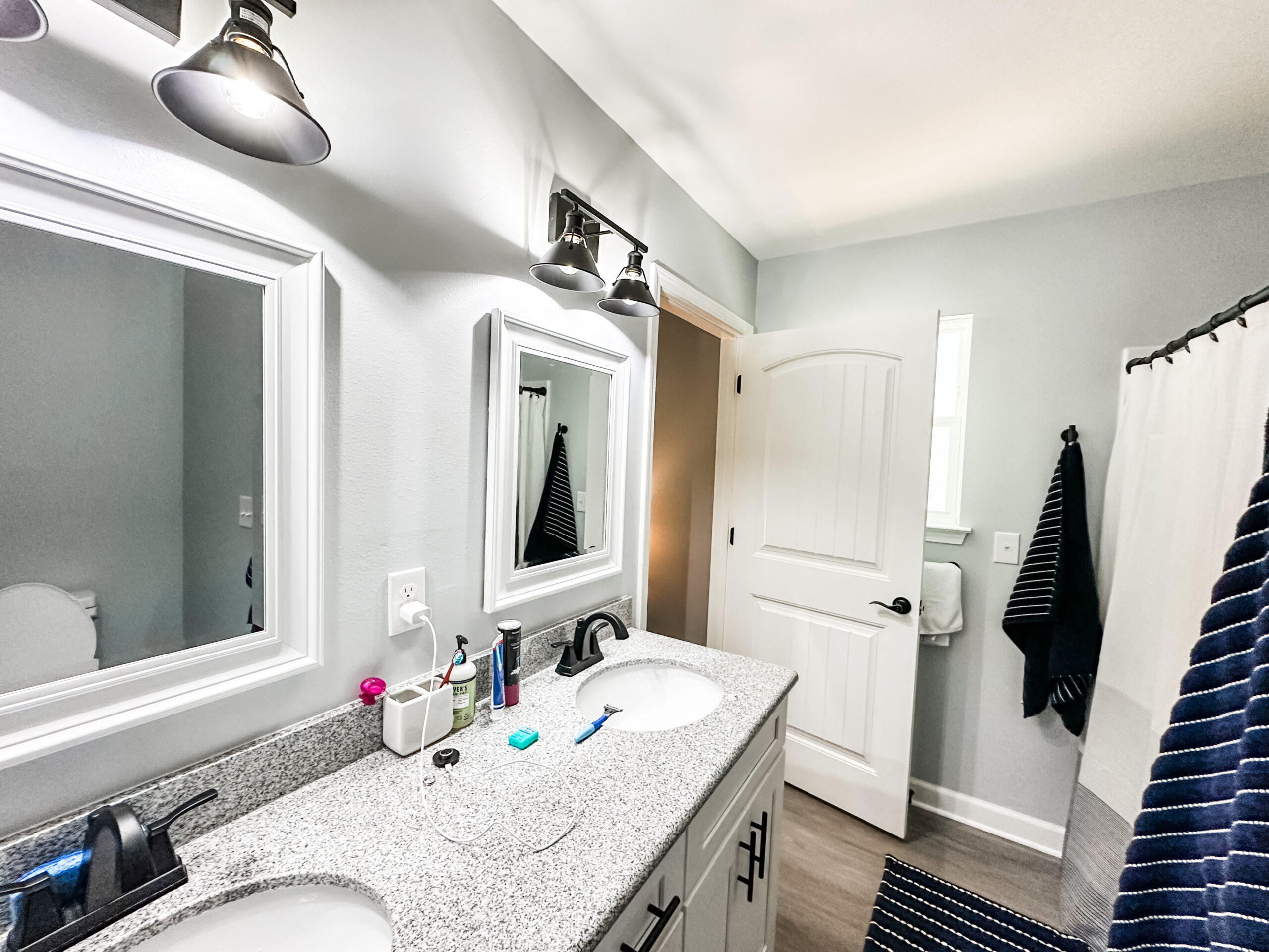
- Bathrooms: This is typically the lightest shade in your palette. Airy, soft blues work beautifully here, because they enhance the fresh, clean feel of the space.
- Hallways & Entryways: These should seamlessly transition into the main living areas, so using the same color maintains a cohesive look and prevents visual disruption. Again, greige is a very popular neutral.
- Accent Walls & Built-ins: Deeper shades add depth and character, making them perfect for accent walls, behind a bookcase, or as a statement piece in a thoughtfully designed space.
- Peppercorn by SW is a rich, moody charcoal gray that is cool-toned and looks absolutely stunning in the kitchen on the oven hood or bottom cabinetry of an island.
Lighting
Lighting is also as important as the room’s purpose. Always test paint samples at different times of day to see how they shift in both natural and artificial light. One of my favorite (and most eye-opening) ways to test paint is by placing large samples on a white poster board and carrying them from room to room.
This method allows you to see how the color reacts to different lighting conditions, times of day, and even outdoor reflections – all of which can dramatically affect the way a color appears.
A color you love as a cool gray in one room might surprise you by looking violet or even green in another!
3. Match Pain Selections with Your Home’s Preexisting Finishes
Cohesive Colors
When choosing paint, consider flooring, cabinets, countertops, and furniture to create a cohesive look. It’s important to stick to a palette of all warm tones or all cool tones. Trying to go against the tones can make an interior look off and older, instead of fresh and cohesive.
Best Color Pairings for Wood Tones
- Warm wood tones (oak, honey, walnut) pair best with warm greiges, soft taupes, and creamy whites to maintain a cozy, natural flow. Avoid cool grays, which may clash.
- Cool-toned wood (gray, driftwood, whitewashed) works best with cool greiges, soft grays, crisp whites, or blue-grays for an airy feel. Avoid warm beiges or yellows.
4. Decide on the Overall Vibe and Mood You Would Like Each Room to Convey
Emotion
What feeling do you want the room to evoke?
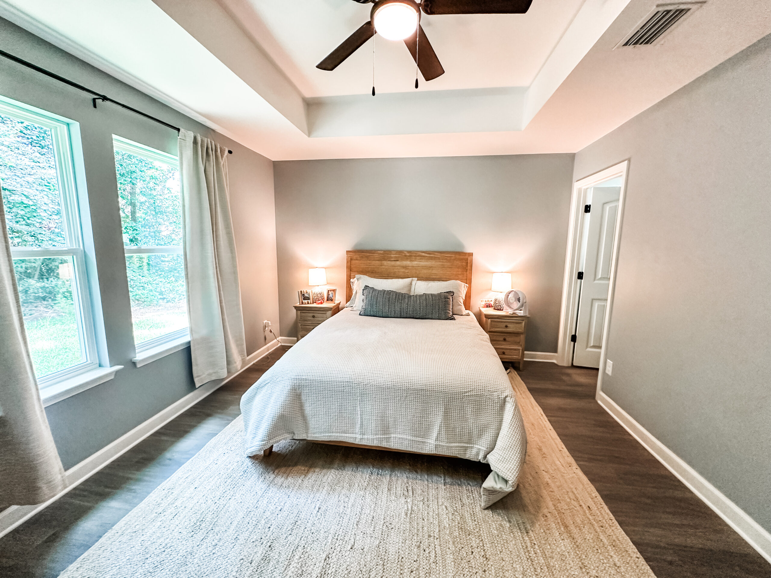
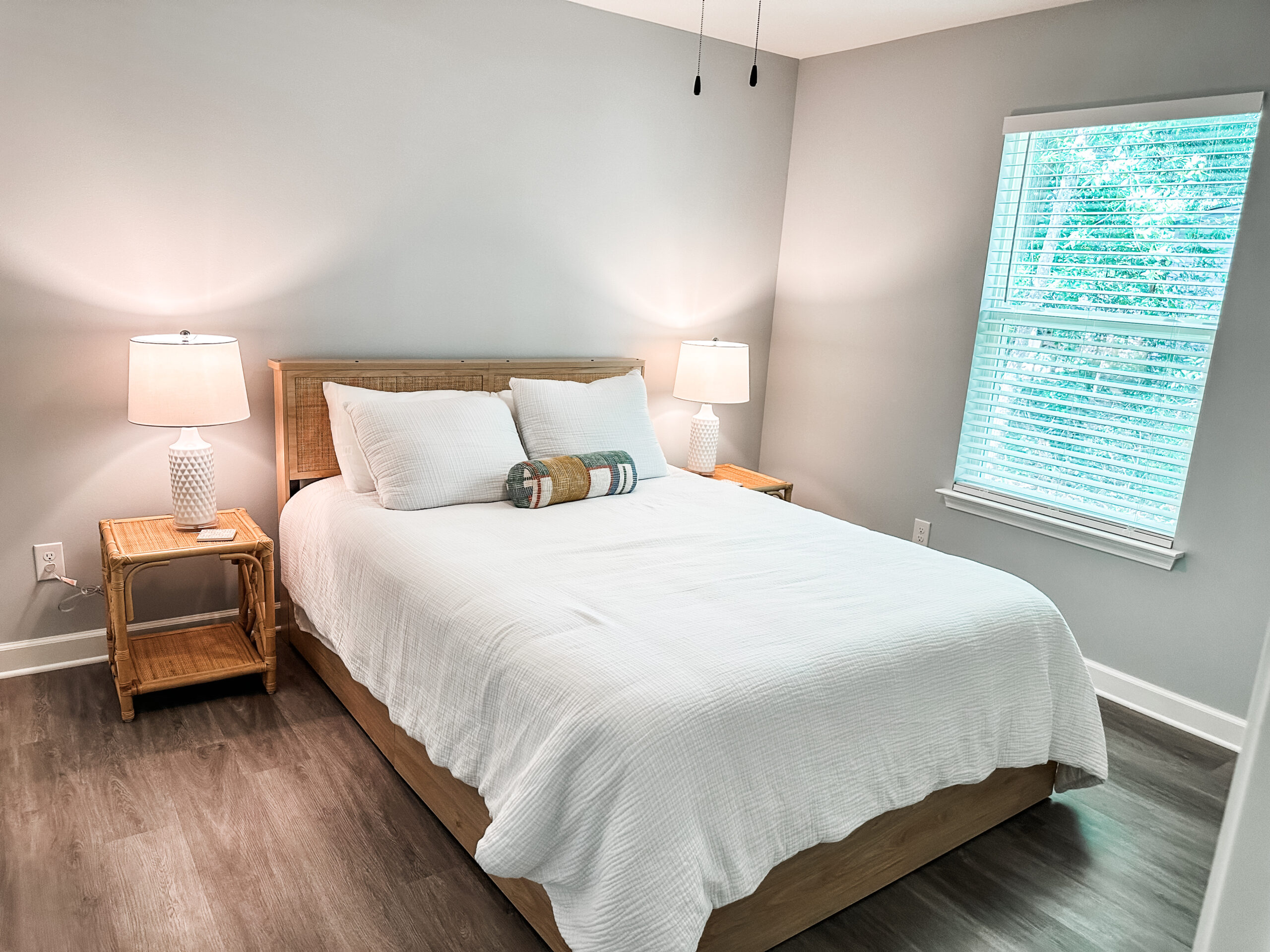
- Light & Airy: Bedrooms and bathrooms look lovely in a soft, barely-there blue-gray like Sherwin-Williams “Misty” or a soft, cool-toned blue-gray like “Silver Lake” that brings a tranquil, airy feel to any space.
- Moody & Sophisticated: Opt for deeper shades like “Smoky Blue” to paint the wall behind a bookcase or a warm neutral to balance the cool tones like “Keystone Gray” as a board & batten wall in an office.
- Classic & Timeless: For the living room, hallways, and dining room, “Agreeable Gray” and “Winter Walk” are gorgeous neutrals.
5. Six Coastal Farmhouse Decor Tips for Creating the Perfect Ambiance.
Ambiance
- Choose a soft, neutral color palette with 3-5 colors.
- Use and layer natural textures such as linen and cotton, wicker and rattan, drift wood and metal.
- Maximize natural light with sheer curtains and soft, warm bulbs.
- Use greenery like potted olive trees, eucalyptus, or fiddle leaf figs.
- Create cozy, functional spaces with woven throws, layered bedding, and soft sectionals.
- Try your paint colors in real life, your real life. Don’t rely on virtual renderings or the lighting in the paint store.
Final Thoughts on Creating Your Dream Coastal Farmhouse Look
Choosing the right blue-gray for your coastal farmhouse is about more than just picking a pretty color—it’s about finding a shade that complements your home’s fixed elements, enhances natural light, and reflects the mood you want to create.
Take the time to test samples, observe undertones, and consider how the color interacts with your space throughout the day. With the right choice, your coastal farmhouse will feel effortlessly stylish, serene, and timeless.
To get started, you can order your Peel and Stick paint samples from Sherwin-Williams here.
Happy Painting!
Katie
Download your Coastal Farmhouse Color Guide Here.
Leave a Reply


Click Here to leave a comment
Comments